The Digital Marketing Magazine recently reported on some research by marketing agency Digimax. The research asked small businesses about their discussions with web designers while working on creating their new website. Here are some of the key findings:
- 9% of the time spent in discussions focuses on website conversion
- 3% of time is given to branding
- 27% of discussion time was spent on layout
- 23% on graphics and pictures
- Content takes up 38% of the time
Obviously, as a small business you want your website to looks great. You want it to be attractive and appealing, as in many cases it will be the gateway for new customers and new business. Content was given the most time for discussion and this, of course, is what keeps your users engaged – but then what? 98% of the businesses questioned actually said that they are building a website to make more money. So surely encouraging users to buy, or at least make an action, is the next (very important) step, once they have been impressed by a beautiful looking site and consumed all of your engaging content. So if you’re having a new website created, or you’re considering a re-design here are some tips to help turn your visitors into customers by considering your website conversion.
Website Conversion – What To Consider
Calls To Action – it needs to be clear and easy for your user to do what you want them to do. Whether that’s to make an enquiry, sign-up or buy something. If your CTA is hard to find, unclear or involves to0 many clicks or slow loading pages you risk losing potential customers.

Usability & Navigation – does your menu structure make it easy for users to get where they want to be? Are you making the journey from entering your site to making a conversion easy? Put yourself in your user’s shoes, or even better ask someone to test it out and go through the user journey step by step.
Use Analytics – if you’re creating your first website this won’t apply, but if you’re updating or changing your website take a look at your Google Analytics (or inbuilt CMS) analytics. You will be able to find our which pages are most viewed, which pages people bounce from most and so may be least appealing, and much, much more that will help you design a more tailored and insightful new design with your users in mind.

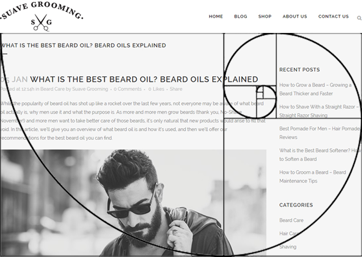
A Bit Of Psychology – now there are a number of opinions out there about what works… or whether psychology plays a part at all, but it can be worth reading into or at least discussing with your web designer. The ‘Golden Ratio’ for example is one theory based on making your landing page appealing for the eye by creating a certain content layout. Experimenting with colour and where you use it may also make a difference. Again, if you’re able to draft in some family and friends to help you test one option against the other this may give you some real evidence to work with.
